Project 1: Graphical representation
All graphs were drawn using Excel's graphing function.
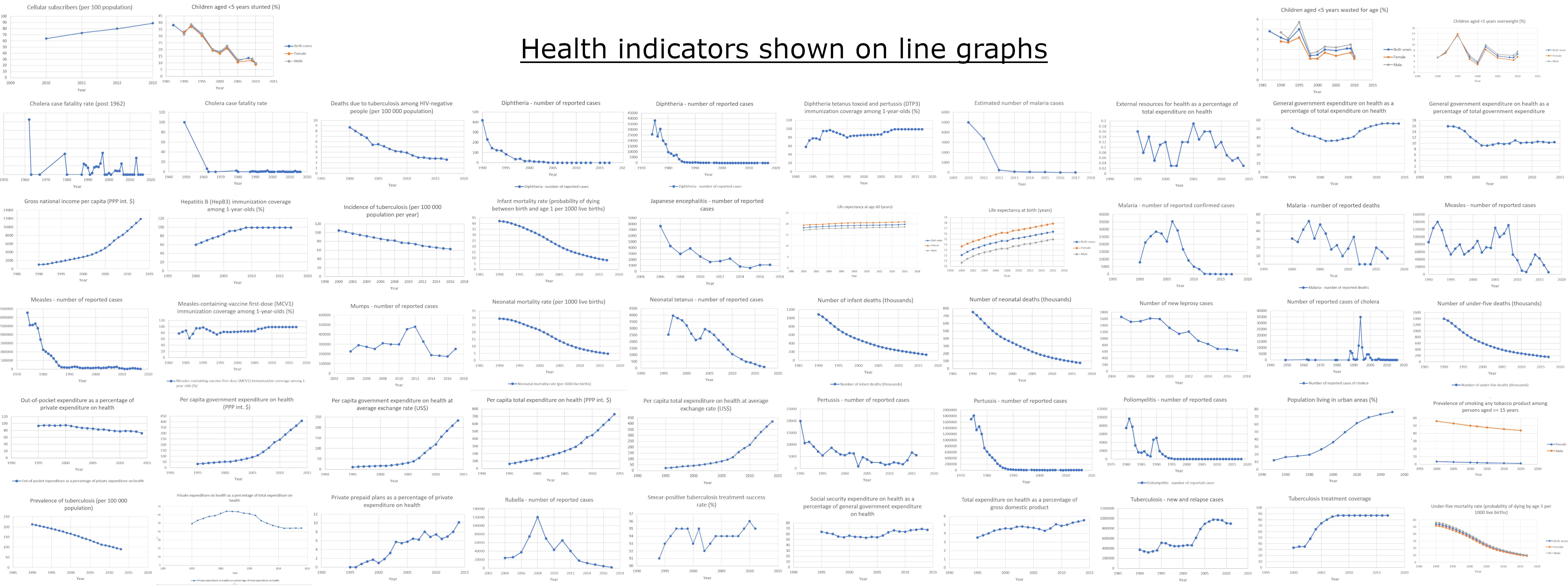
The indicators with readings across multiple years were plotted on a line graph since this would allow the best method of interperting the data. This method of representation enables the reader to understand how the indicator has changed over time. A few examples are shown below.
Life expectancy at Birth(years).JPG)
Number of infant deaths (thousands)
.JPG)
Per capita total expenditure on health (PPP int. $)
.JPG)
All the line graphs are available here.
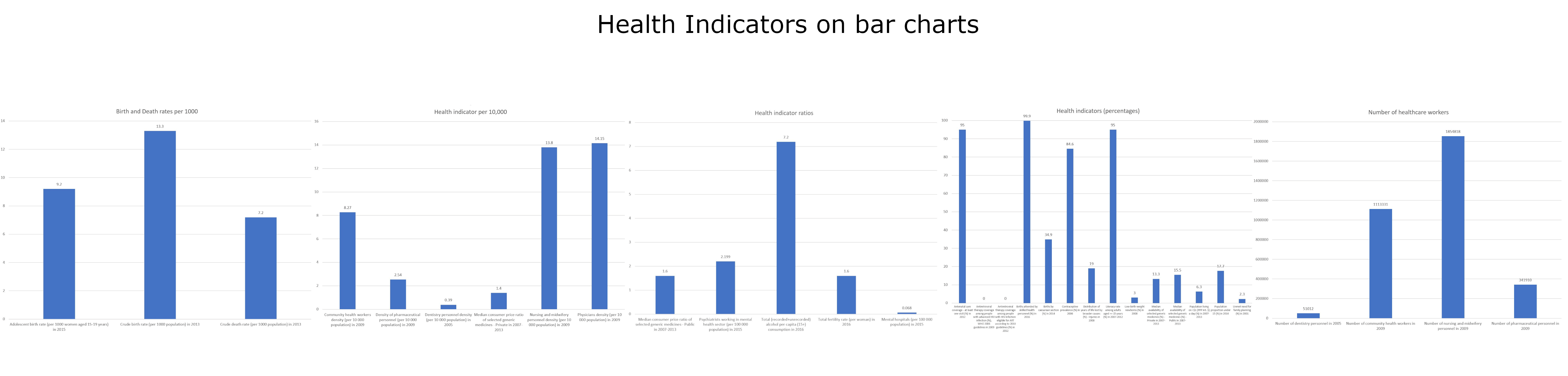
The entries with only one were combined with similar entries; percentages were plotted together and per 1000 were plotted together etc. These were plotted as bar charts.
Birth and Deaths Rates.JPG)
Health indicator per 10,000
.JPG)
Health Indicator Ratios
.JPG)
Health indicators percentages
.JPG)
Number of Healthcare workers
.JPG)
All the graphs are bar charts are here and all other graphs are here